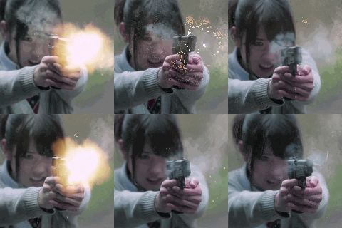


Pony Canyon is taking pre-orders for a special box set with a photo-op event ticket. events are on 3/8 (Osaka), and 4/5 (Tokyo)
http://www.helloproject.com/event/14012 ... cheki.htmlhttp://ps.ponycanyon.co.jp/BerryzKOBO/tracklist :
Limited A, Limited C, Regular A
1. Otona na no yo!
2. 1-Oku 3-Senman sou Diet Oukoku
3. Otona na no yo! (instrumental)
4. 1-Oku 3-Senman sou Diet Oukoku (instrumental)
Limited B, Regular B
1. 1-Oku 3-Senman sou Diet Oukoku
2. Otona na no yo!
3. 1-Oku 3-Senman sou Diet Oukoku (instrumental)
4. Otona na no yo! (instrumental)
-----
Limited A DVD :
1. Otona na no yo! MV
2. Otona na no yo! Making
Limited B DVD :
1. 1-Oku 3-Senman sou Diet Oukoku MV
2. 1-Oku 3-Senman sou Diet Oukoku Making
Limited C DVD :
1. Otona na no yo! Close-up ver.
2. 1-Oku 3-Senman sou Diet Oukoku Close-up ver.
3. Otona na no yo! Dance shot ver.
4. 1-Oku 3-Senman sou Diet Oukoku Dance shot ver.
 i'll wait to see if anyone else notices, i don't want to mention it yet because it's a "can't un-see" type thing rofl.


